
1. What Custom Dashboards Are
Custom Dashboards are configurable, chart-based reporting views built from widgets. Each widget displays a specific data type in a specific chart format — bar graph, line graph, pie chart, or table — filtered to whatever scope you configure.
You build the dashboard once. Publish it to a role. Everyone in that role sees it automatically on their home screen or in their Dashboards section. It updates in real time as new submissions, tasks, and flagged items come in.
Common use cases:
- Area Manager dashboard showing average audit scores and flagged items across their district
- Store Manager dashboard showing today's task completion and overdue items at their location
- Operations Director dashboard showing completion rates and flagged trends across all regions
- QA dashboard showing food safety flag counts and score trends over 90 days
2. Creating a Dashboard
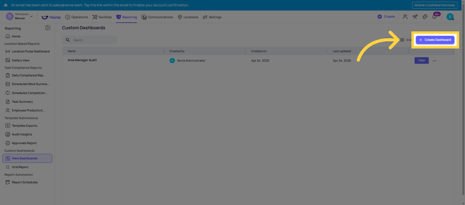
- Go to Reporting → Custom Dashboards (or Dashboards tab)
- Click + Create Dashboard or + New
- Give it a clear name: "Area Manager Audit Dashboard," "Store Manager Daily View," "Operations Overview — District Level"
- You're now on a blank canvas — add widgets one at a time
3. Adding a Widget — The Build Process
For each widget:
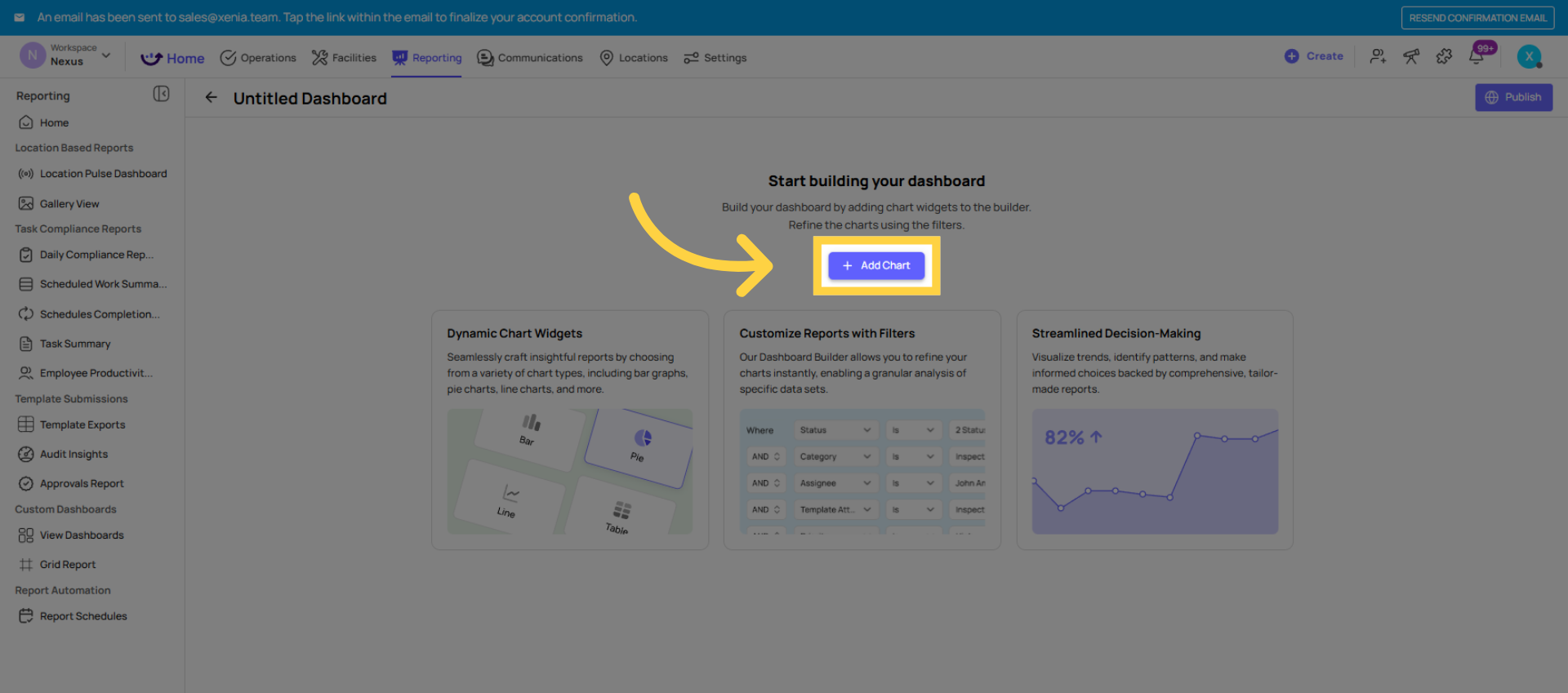
- Click + Add Chart or + Add Widget
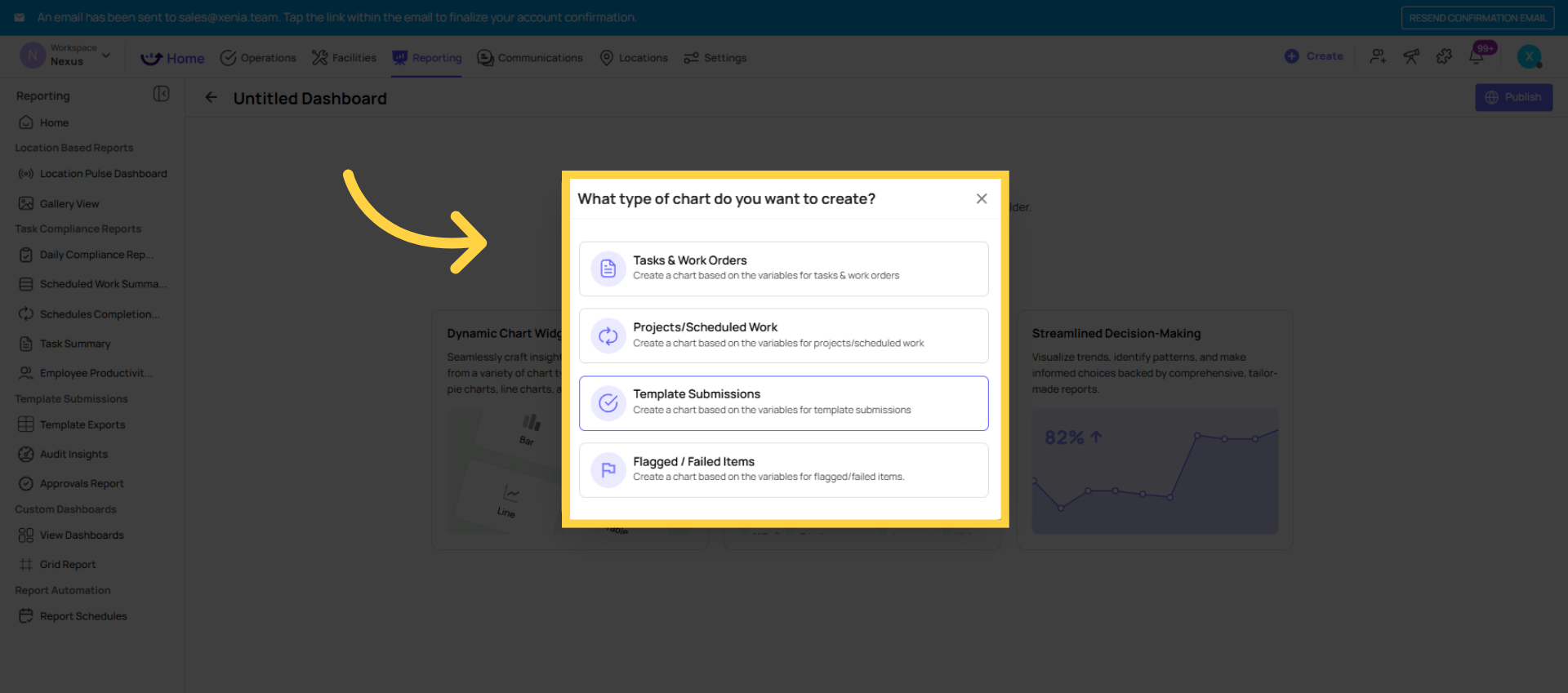
- Choose the data type:
- Task / Work Order data
- Template Submissions / Scheduled Checklist Submissions
- Flagged Responses / Flagged Items
- Project Completion Rates
- Scoring / Audit Scores
- Choose the variable — what the chart is measuring:
- Count (how many items)
- Average Score
- Completion Rate (%)
- Grouped by Category, Location, Date, Status, etc.
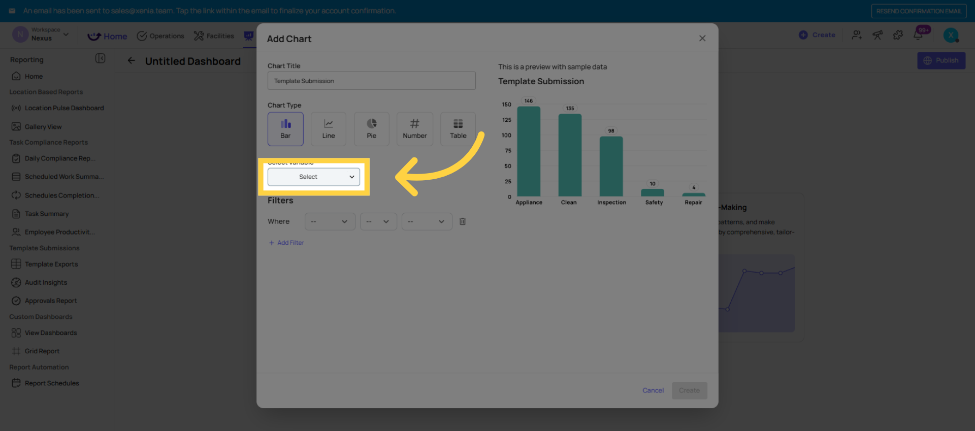
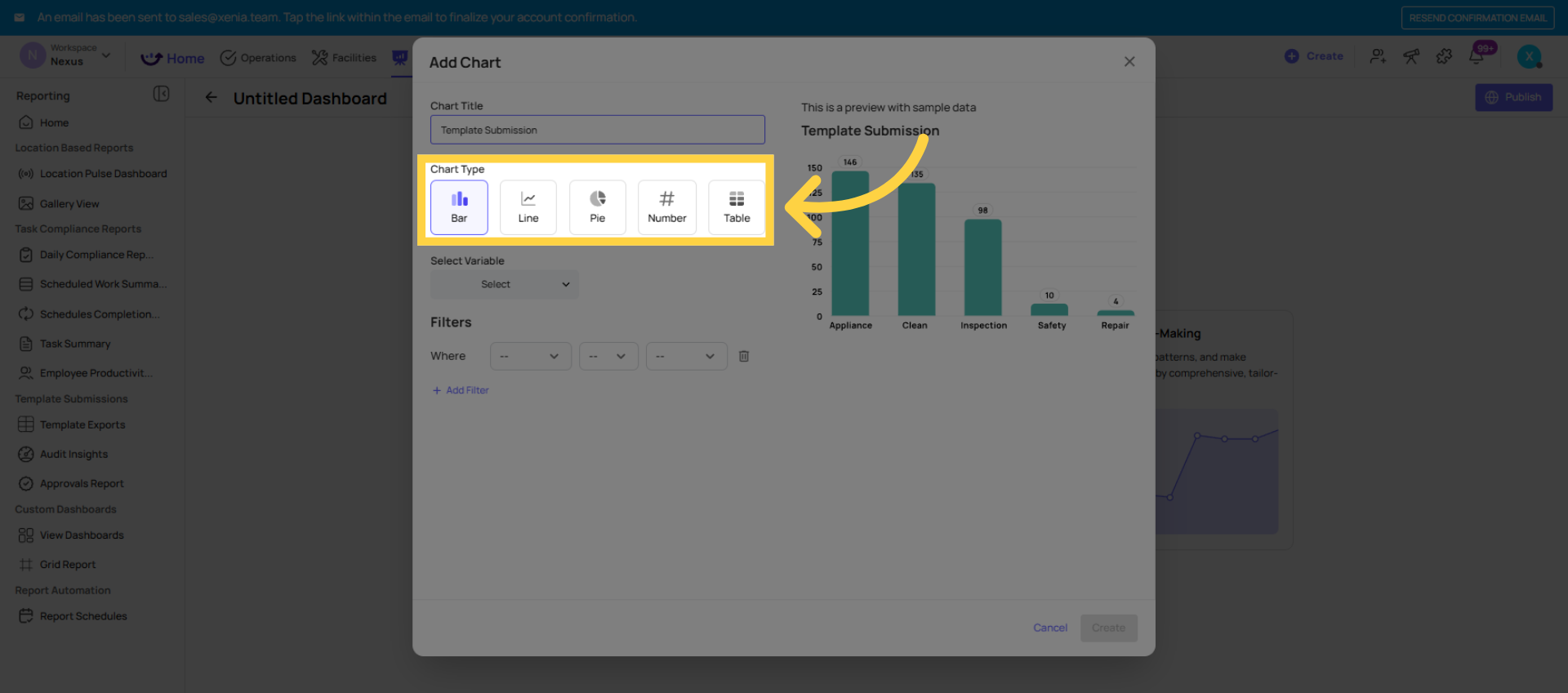
- Choose the chart type:
- Bar Chart — compare values across locations or categories
- Line Chart — show trends over time
- Pie Chart — show proportional breakdown by category
- Table — show a data table rather than a visual chart
- Apply filters:
- Template name — critical for isolating audit data from daily checklist data
- Location or location group
- Date range (Last 7 days, Last 30 days, Last 90 days)
- Category (for flagged items)
- Status (for task/project data)
- Click Create — the widget appears on the canvas
Repeat for each widget. Drag and drop to rearrange the layout.
4. Common Widget Configurations
Average Audit Score by Location (Bar Chart):
- Data type: Template Submissions / Scoring
- Variable: Average Score by Location
- Chart type: Bar Chart
- Filter: Template = [your audit template], Date = Last 30 days
Flagged Items by Category (Pie Chart):
- Data type: Flagged Responses
- Variable: Count by Category
- Chart type: Pie Chart
- Filter: Template = [your audit template], Date = Last 30 days
Flagged Items by Location (Bar Chart):
- Data type: Flagged Responses
- Variable: Count by Location
- Chart type: Bar Chart
- Filter: Template = [your audit template], Date = Last 30 days
Project Completion Rate by Location (Bar Chart):
- Data type: Project Completion
- Variable: Completion Rate by Location
- Chart type: Bar Chart
- Filter: Project = [specific project or all], Date = Last 30 days
Audit Score Trend Over Time (Line Chart):
- Data type: Template Submissions / Scoring
- Variable: Average Score by Date
- Chart type: Line Chart
- Filter: Template = [your audit template], Date = Last 90 days
Number of Open Work Orders by Month (Bar Chart):
- Data type: Work Orders
- Variable: Count by Month
- Chart type: Bar Chart
- Filter: Status = Open
5. Publishing and Restricting Access
Once all widgets are built:
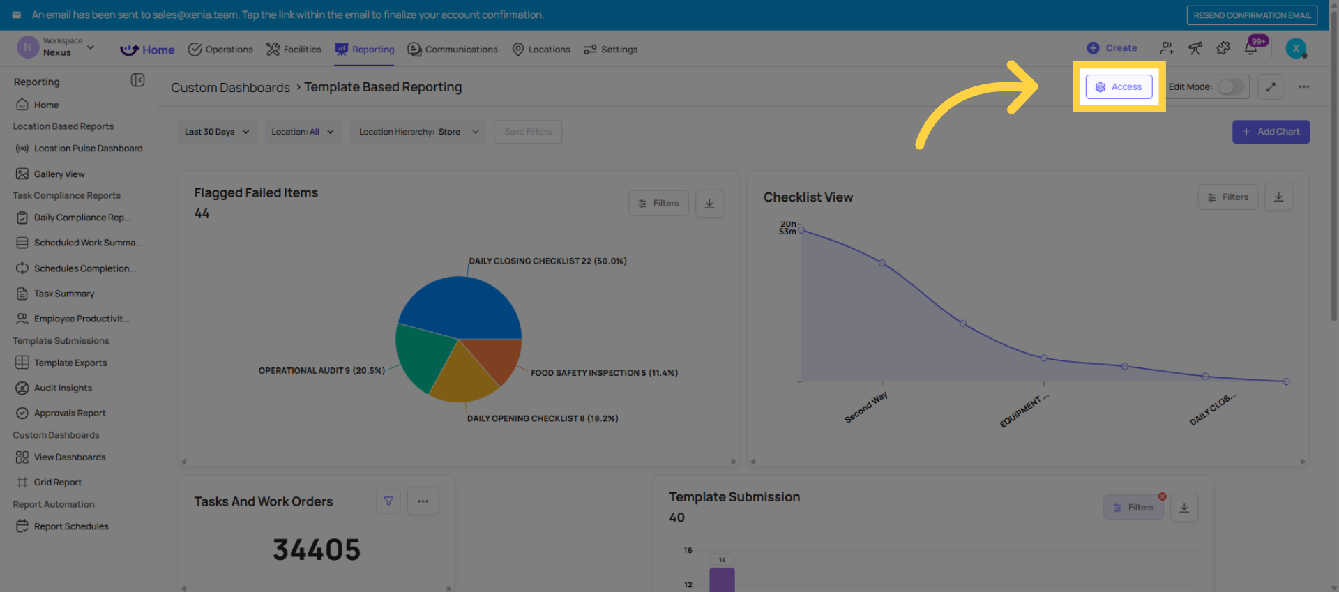
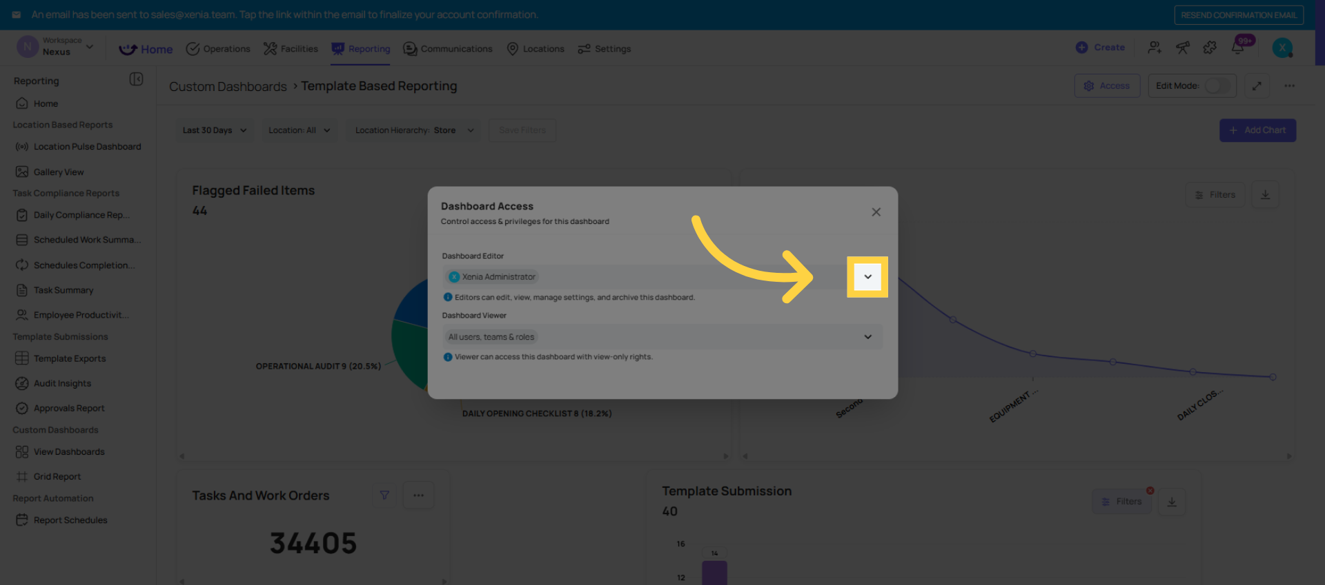
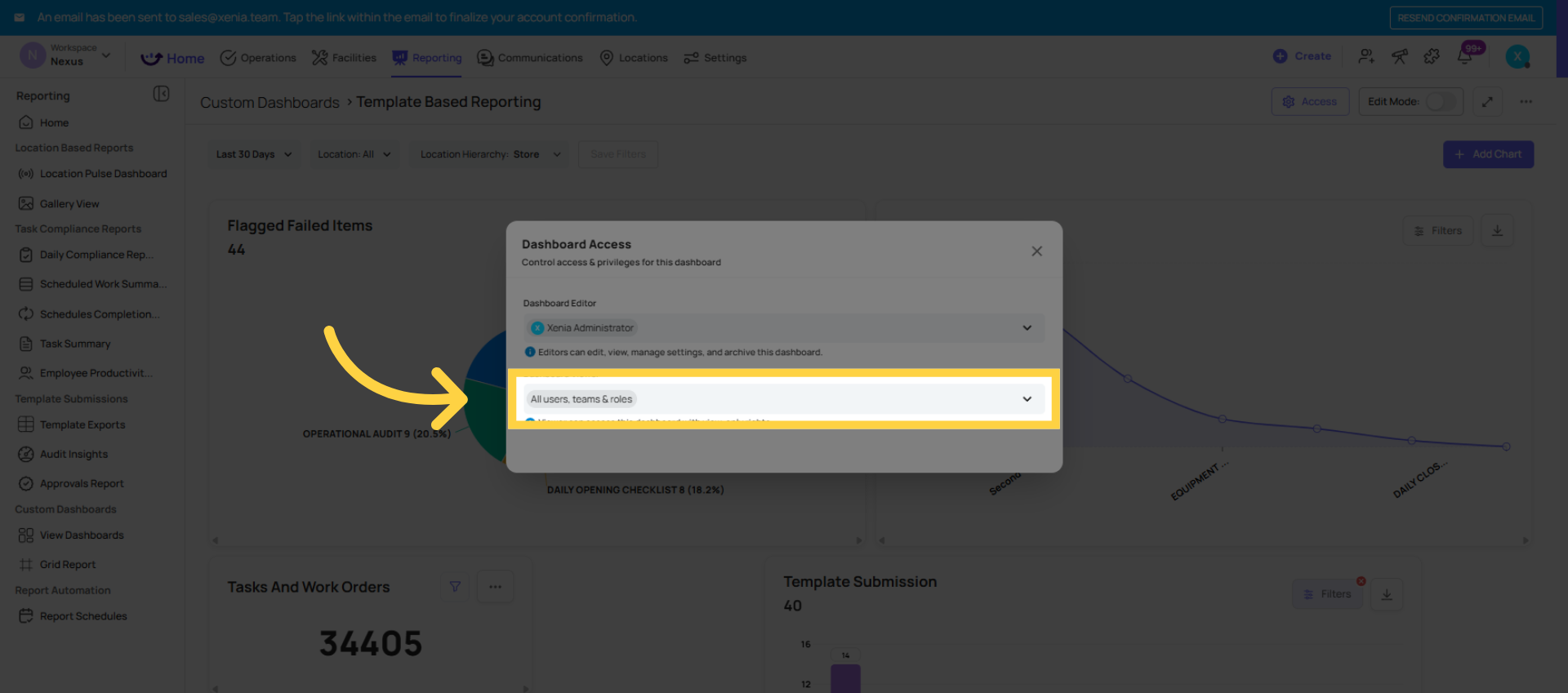
- Click Publish or find the Access settings
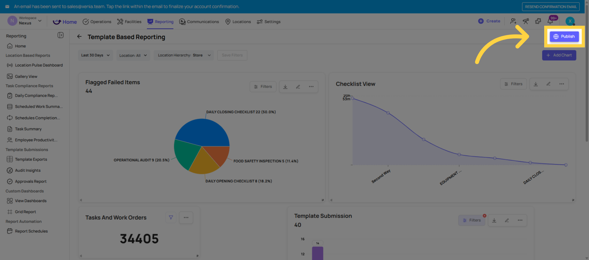
- Set which roles can see this dashboard:
- Area Manager role → Area Manager Audit Dashboard
- Store Manager role → Store Manager Daily View
- Admin/Owner → can see everything
- Restrict dashboards with sensitive data (HR, compliance scores across all regions) to the appropriate roles
Setting as the home screen for a role: Go to Settings → Roles → [Role Name] → Home Page Layout → select this dashboard. Now every user in that role sees this dashboard as their Xenia home screen. It appears automatically — no navigation required.
Need Help?
Reach out to our Support Team at Support@xenia.team
Comments
0 comments
Please sign in to leave a comment.