1. When to Build a Custom Dashboard vs. Using Audit Insights
Audit Insights is the out-of-the-box view — available immediately, structured by Xenia. Custom dashboards give you control:
- Choose exactly which charts appear and in what order
- Pre-apply filters so the viewer doesn't have to configure anything
- Restrict the dashboard to specific roles so it appears on their home screen automatically
- Combine audit data with other data types (task completion, corrective actions, flagged items from other templates)
- Name and brand it for your organization's context ("Area Manager Dashboard," "GM Scorecard," "Monthly Compliance Overview")
The typical use case: An admin builds the dashboard once. Area Managers see it on their home screen without having to configure anything. It shows exactly the data relevant to their scope — their district's locations, their audit template, their flagged item categories. They just open the app and the insights are there.
2. Planning Before You Build
Before opening the dashboard builder, answer these questions:
Who is this for? Area Manager? District Manager? GM? This determines which data scope makes sense and which role the dashboard gets published to.
What data do they need to see? Most audit dashboards for Area Managers include:
- Average audit score by location (their district)
- Flagged items by category (their audit template only)
- Flagged items by location (which stores have the most issues)
- Completion rate (are all audits being submitted on schedule)
- Optionally: time to complete audits (are auditors rushing through)
What date range should default? Last 30 days covers the monthly audit cycle. Last 7 days for weekly walkthroughs.
Which template(s) should this filter to? If flagged item categories are used across multiple templates (daily checklists AND audits both use a "Food Safety" category), filter each widget to the specific audit template to avoid mixing audit data with daily operational data.
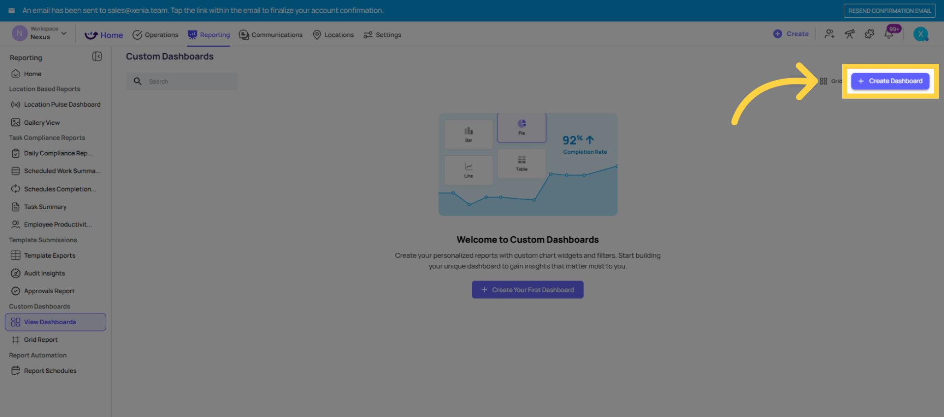
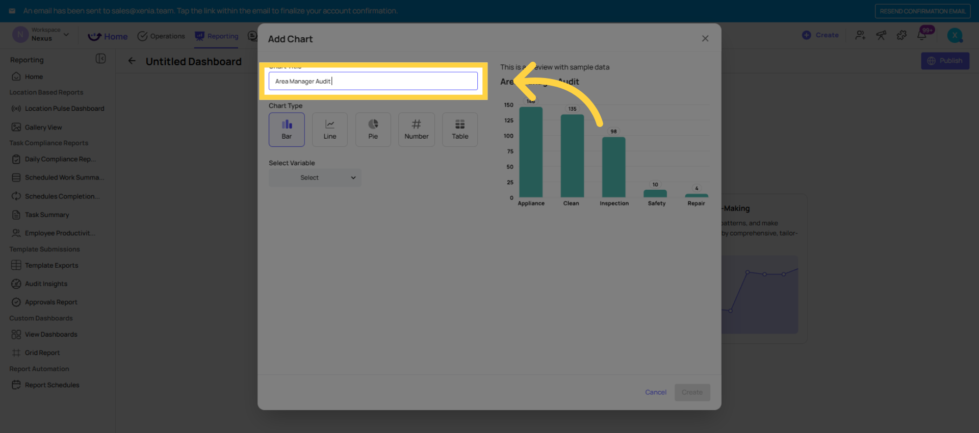
3. Creating the Dashboard
- Go to Reporting → Custom Dashboards
- Click Create Dashboard (or Add Dashboard)
- Give the dashboard a clear name — "Area Manager Audit Dashboard" or "Monthly Audit Overview — District Level"
- You're now in the dashboard builder — a blank canvas where you'll add widgets (charts) one by one
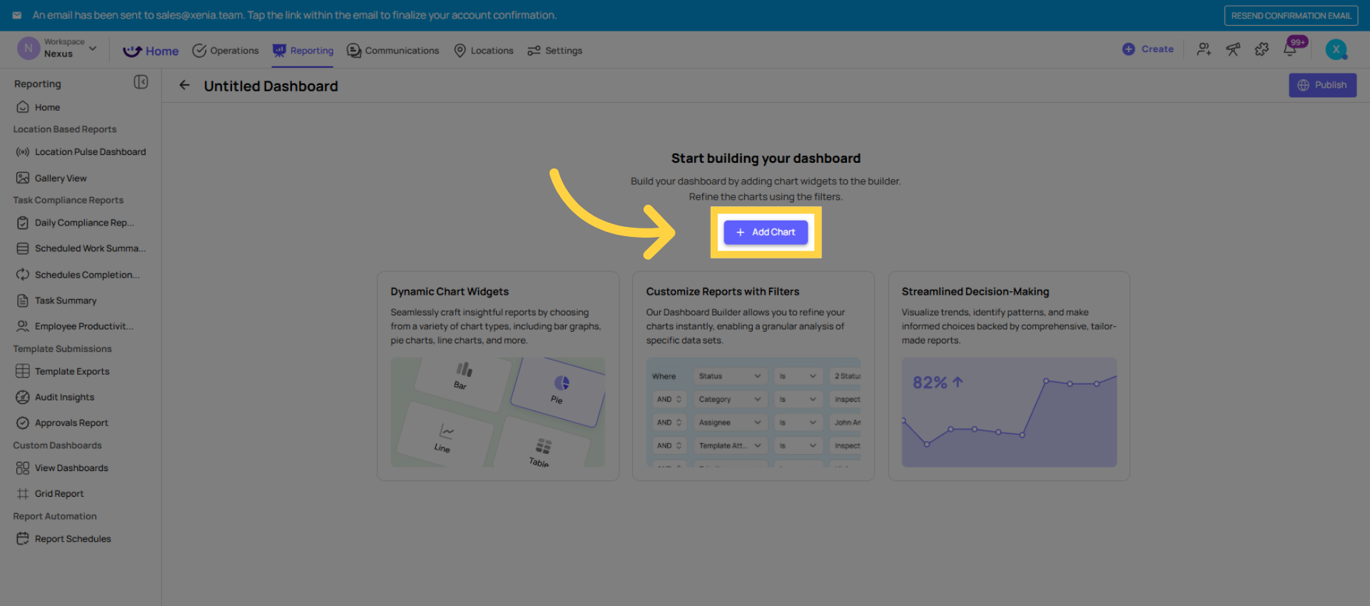
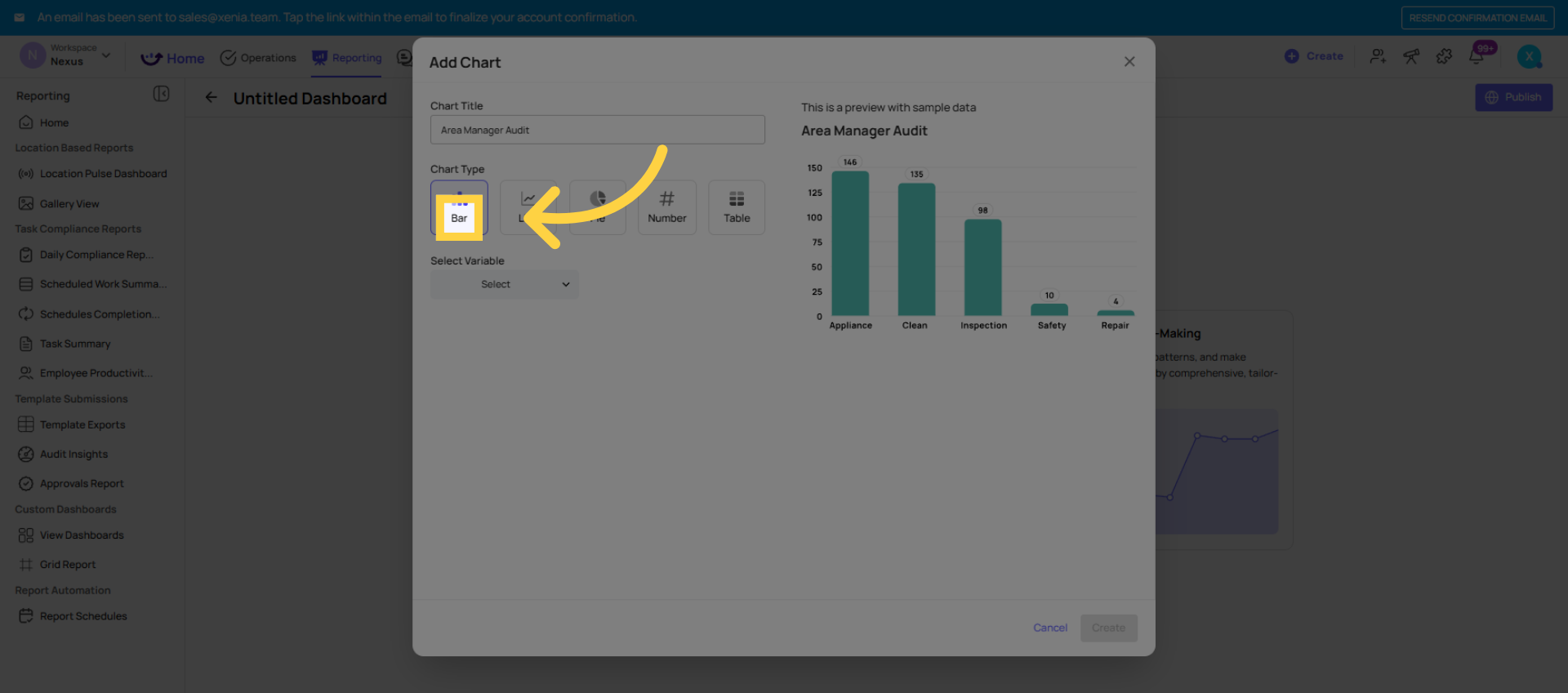
 Click Add Chart to include a new chart in your dashboard.
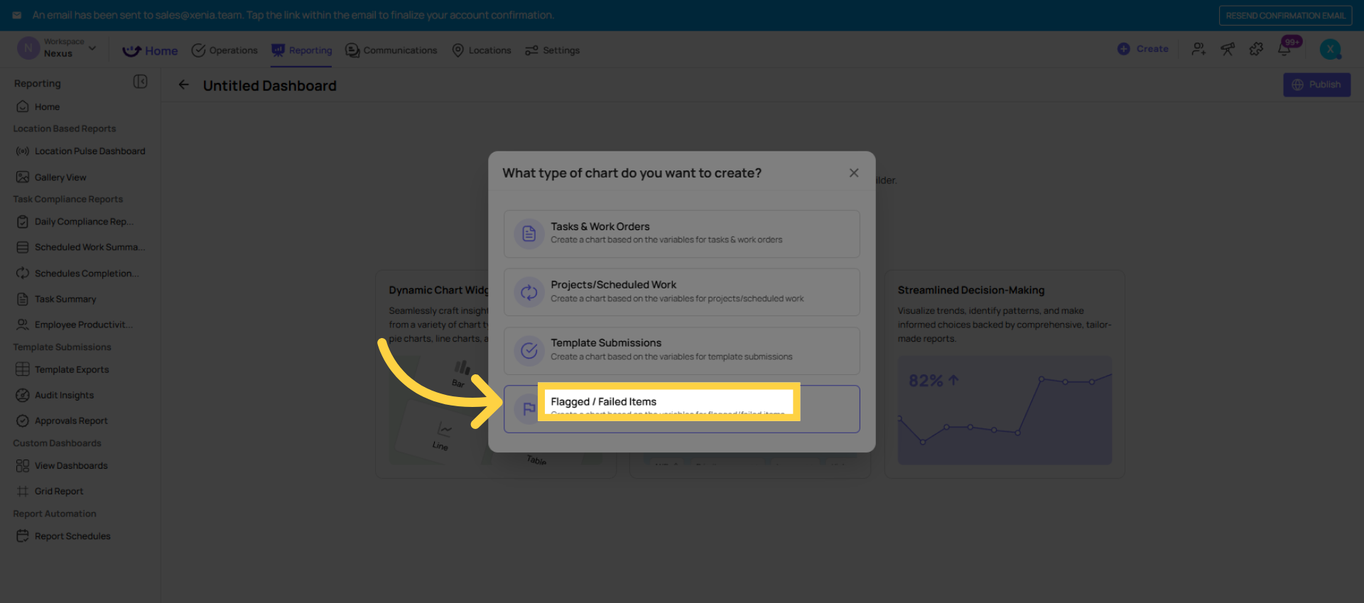
 Click Flagged / Failed Items to choose this chart type for your dashboard.
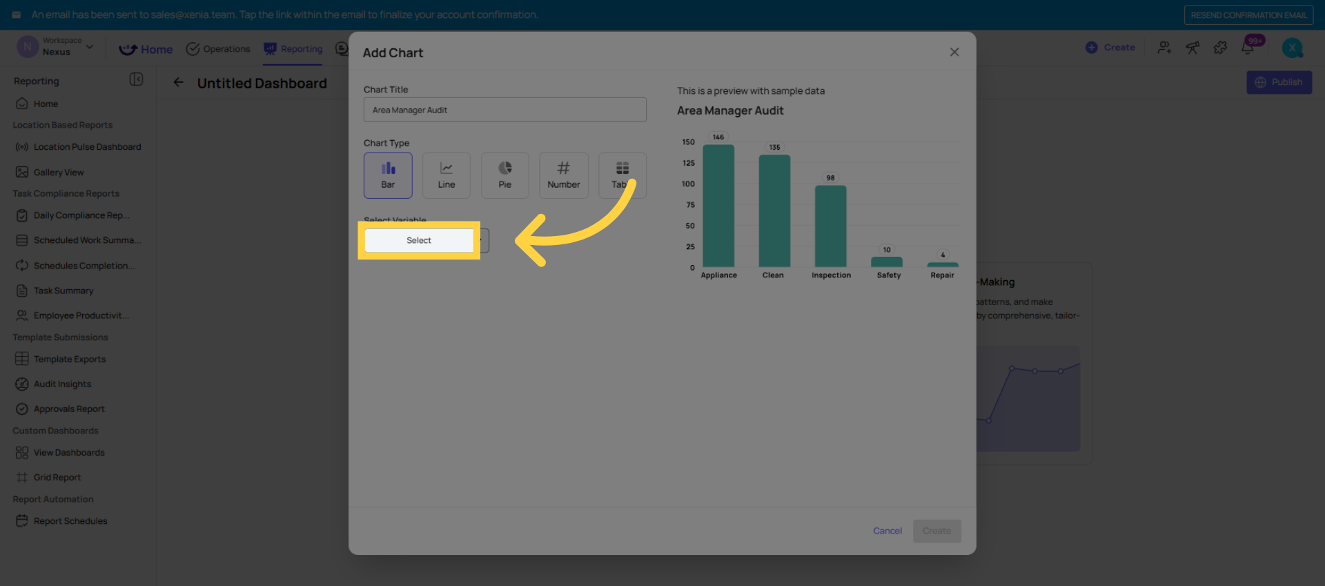
 Widget 1 — Average Score by Location (Bar Chart)
This is the most important widget on an audit dashboard. It shows the portfolio health view — which locations are scoring well and which are below threshold.
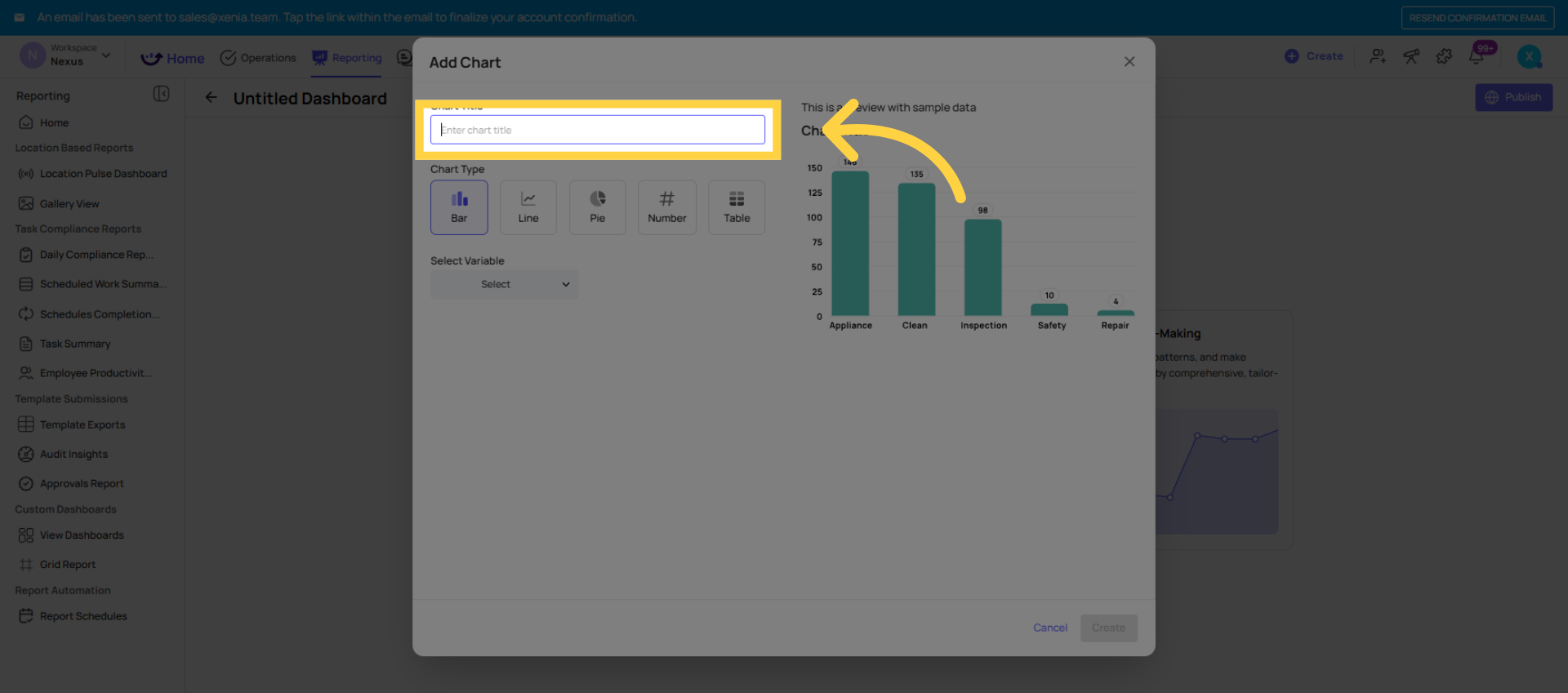
- Click Add Chart
- Data type: Average Score (look for Submissions or Scoring data type)
- Variable: Average Score
- Chart type: Bar Chart (shows each location on the X axis with score on the Y axis)
- Filter: Template = [your audit template name]
- Filter: Location = [relevant locations for this dashboard's audience, or use location group]
- Filter: Date range = Last 30 days (or Last 7 days for weekly audits)
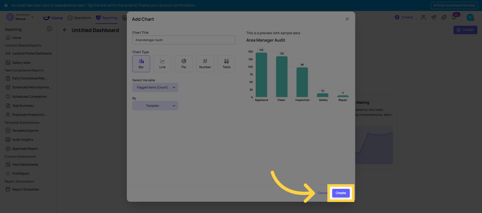
- Click Create
The bar chart now shows one bar per location with the average audit score for the selected period. Locations below threshold are visually immediately apparent.
Tip: If you have a location hierarchy set up (Region → District → Store), use the Group By function to group bars by district. This lets an organization-wide dashboard segment by region without filtering to specific locations.
 Widget 2 — Flagged Items by Category (Pie Chart)
Shows what types of issues are coming out of the audits most frequently — the issue pattern view.
- Click Add Chart
- Data type: Flagged Items
- Variable: Count by Category
- Chart type: Pie Chart (best for showing proportional breakdown by category)
- Filter: Template = [your audit template name] — critical to filter here if flagged categories are shared across templates
- Date range: Last 30 days
- Click Create
The pie chart shows the proportion of each flagged category. "Maintenance" at 40%, "Cleanliness" at 30%, "Food Safety" at 20% tells the Area Manager at a glance what type of problems dominate their audit results this month.
Clicking into any slice: Opens the specific flagged responses in that category — the individual questions, photos, and comments. The chart is fully interactive.
 Widget 3 — Flagged Items by Location (Bar Chart)
Shows which specific locations have the most flagged issues — the accountability view. Different from Widget 2 which shows what kinds of issues; this shows where the issues are concentrated.
- Click Add Chart
- Data type: Flagged Items
- Variable: Count by Location
- Chart type: Bar Chart
- Filter: Template = [your audit template name]
- Optionally filter: Category = [specific category if you want location breakdown for one issue type, e.g., "Food Safety issues by location"]
- Date range: Last 30 days
- Click Create
- The bar chart shows each location on the X axis and the count of flagged issues on the Y axis. The store with the tallest bar has the most flagged issues. Clicking into that bar drills into that location's specific flagged responses.
Widget 4 — Completion Rate (Bar Chart or Line Chart)
Tracks whether audits are actually being submitted on schedule — the operational discipline view.
- Click Add Chart
- Data type: Submissions or Completion Rate
- Variable: Count by Date (for a trend line) or by Location (for a bar comparison)
- Chart type: Line Chart for trends over time; Bar Chart for location comparison
- Filter: Template = [your audit template name]
- Date range: Last 30 days
- Click Create
This widget shows whether audits are being submitted consistently. Gaps in the line chart or low bars for specific locations tell you where the audit discipline is breaking down — before you even look at scores.
4. The Three-Widget Minimum for an Audit Dashboard
If you're building your first audit dashboard and want something simple and immediately useful, start with just three widgets:
- Average Score by Location (bar chart, filtered to your audit template, last 30 days)
- Flagged Items by Category (pie chart, filtered to your audit template, last 30 days)
- Flagged Items by Location (bar chart, filtered to your audit template, last 30 days)
Publish it to your Area Manager role. That's a complete, useful audit dashboard that an Area Manager can open every Monday morning and understand their district in 60 seconds. You can always add more widgets over time.
Need Help?
Reach out to our Support Team at Support@xenia.team
Comments
0 comments
Please sign in to leave a comment.